All the snaps I took for this exercise can be seen here.
My two influences are Jose Pedro Croft and Bridget Riley.
From Bridget Riley, I want to take depth perception. I am going to try to create an "Abstract Head" using coloured lines that follow from front to back of a box. This will give physical depth to the piece, but I want the finished piece to "work" in two dimensions. We'll see how it goes in my six hour study.


I bought half a metre of Art Books from a friend of a friend the other day, and in this pile was an old exhibition catalogue of the work of Jose Pedro Croft. It was beautiful sculpture using simple forms and objects, but I realised he must have moved on by now. And he has. So here's some work that I will take as "Influence 1".


.jpg)

In this task I want to explore 2D drawing in a 3D world. I am going to use a box to hold a 3D volume and then re-create an "Abstract Head" using coloured tape. If looked at from a directly frontal position, the work should look like a 2D Abstract Head, but it will clearly be a 3D drawing if you move from side to side.

Normally in a 2D drawing you can create perspective by making the lines thicker in the foreground and thinner in the background. With tape this will not be possible, so it will be interesting to see what this does to the perspective. [Of course, as I realised when I was talking to Jo about my work, this is irrelevant, as the tape will APPEAR to be thinner by virtue of it being further away!]
 2
2 3
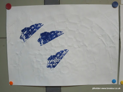
3 4
4I found it very hard to get the perspective right... the angle of each line was difficult to place, especially on lines that I wanted to move from front to back, and diagonally. You can see above how the red line top right has been moved.
This first attempt was also difficult as the box was too small, not only to work with, but with the width of the tape. The second attempt was easier, though still not quite big enough.
 5
5 6
6However, there is no support at the front of the box, so no line can start from this front plane. Maybe with a piece of perspex I could try this (though I´m not sure how I would get my hands in!) Jo suggested a fish tank; and I could make a perspex box.
I´d be interested to see how it would work with no supports at all - maybe using fishing line to suspend pieces of wood, plastic or metal.
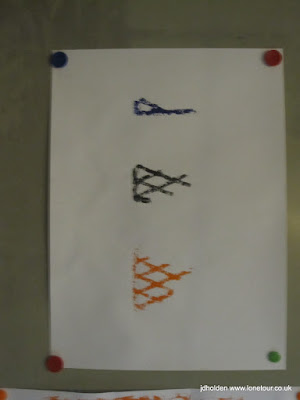
The next stage was to add a couple of planes to the lines.
 7
7 8
8This is fabulous. The "flat" plane is a twisting series of pieces of tape, though I had to add another layer of the original tape to re-instate the line:
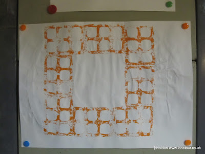
 9
9Some of the tape in these planes is twisted, and this would need resolving in a solid steel form were I to make one.
So what would Croft do with a corner? Alexandre Melo discusses his work thus. "The second determining characteristic in the author's work is the dynamization of the spatial relationships within each work and between each work, and the movement of the viewer's body and gaze. This is precisely the effect of simply placing in one of the corners of the room, and half-way up the wall, a bowl molded out of synthetic resin, which, when we come close to it, we realize has no bottom. Without yielding to the artifices of staging or spectacle, Croft brings life, instability, and dynamism to a situation that would otherwise be stable and dead." Read more about Jose Pedro Croft.
In order to create the square in a corner that is the trademark of an Abstract Head, I used Pythagoras´ theorem to measure 50cm both ways from the corner of the wall and marked a height of 70cm to create my imaginary "square", and then started to create the form.
 10
10 11
11 12
12I did put a black frame around this piece, but Jo was disappointed with it so I took it off later to compare:
 13
13 14
14We also had a discussion about why "Abstract Heads" need to be square. This is really because, when I was creating the first abstract head I certainly couldn´t use a form as "landscape", and "portrait" could be seen as being a whole body. In order to emphasise the "head" part of the portrait I decided to use a square canvas. But why three canvases? Well, this was to take the cubist idea of giving a multitude of viewpoints to create a dynamic whole. It's for this reason that the lines are drawn freehand, quickly and without precision. It is to create a dynamism between the three images.
Once again, the planes make interesting surfaces, and I wonder how these would work in a solid plane, rather than as a series of "planks".
In order to understand my sculptures, I decided to take Richard Serra´s advice: "To draw from my sculpture after its completion is a way of informing myself about the work, trying to bring the piece closer to me, trying to have a look at what I am up to, trying to see it afresh. You only see a work with fresh eyes once; you never see it like that again. To retain that moment, to conclude the work, to distil it into another language, is the essence of my notebook drawings." Richard Serra: Drawings and Etchings from Iceland Matthew Marks, Publisher: Matthew Marks Gallery ISBN: 1880146037 Edition: Hardcover; 1992-01
 15
15 16
16 17
17I found these to be quite organic, and rather frightening, like zombies with missing flesh. Jo, however, suggested they were like maps or ley lines.
As I had run out of tape, but not time, I decided to do a final piece of exploration using some wooden off cuts that were lying around to create a quick 3D with a deep volume. I didn´t want to create a relief sculpture, but something more dynamic:
 18
18 19
19 20
20This last piece was very rushed but it does give some clues as to where I might take the idea into a 3D sculpture.
Overall the 6 hours taught me quite a lot about how I think as an artist. I have lots of ideas, and want to be able to try them all out. I like pottering about in the studio, and very much enjoyed the deadline of the six hours as a means to an end. I spent about an hour in the library the day before, looking at the work of Jose Pedro Croft and Bridget Riley which was certainly very useful in giving me direction for this work. This gave me some extra thinking time overnight which I used to figure out the mathematics of the corner piece; if I had just tried to go straight into it I think I would have failed to create a real square. I´m certainly going to continue investigating the wooden sculpture, which one of my colleagues at the studio likened to a Calder sculpture.
More on Jose Pedro Croft here.
More on Bridget Riley Here.


 C
C